Dun Laoghaire Golf Club
Crest refined and brand guidelines
Brand Guidelines
In 2027, Dun Laoghaire Golf Club will welcome the KPMG Women’s Irish Open to Ballyman Glen, 20 years after moving there. For a members’ club with a history stretching back to 1910, it’s a chance to share a place its members are proud of with a new audience.
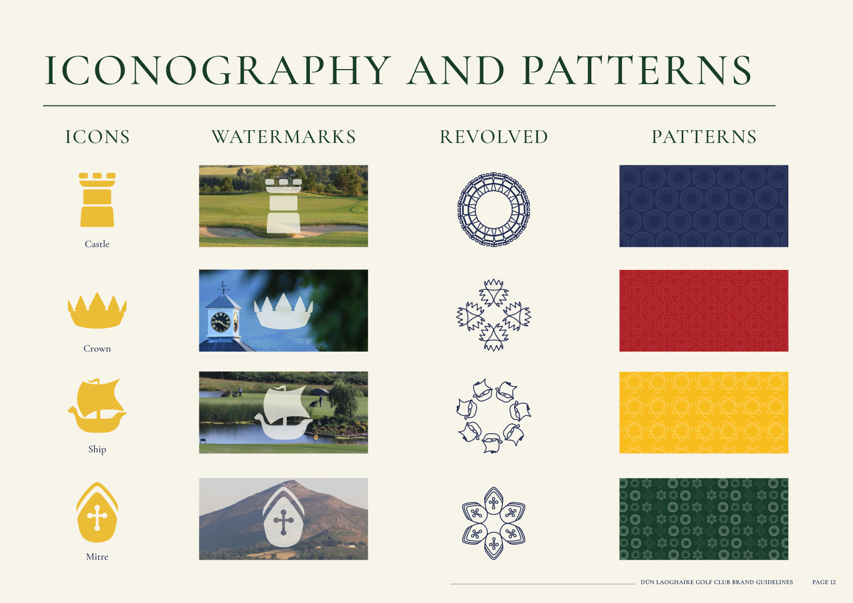
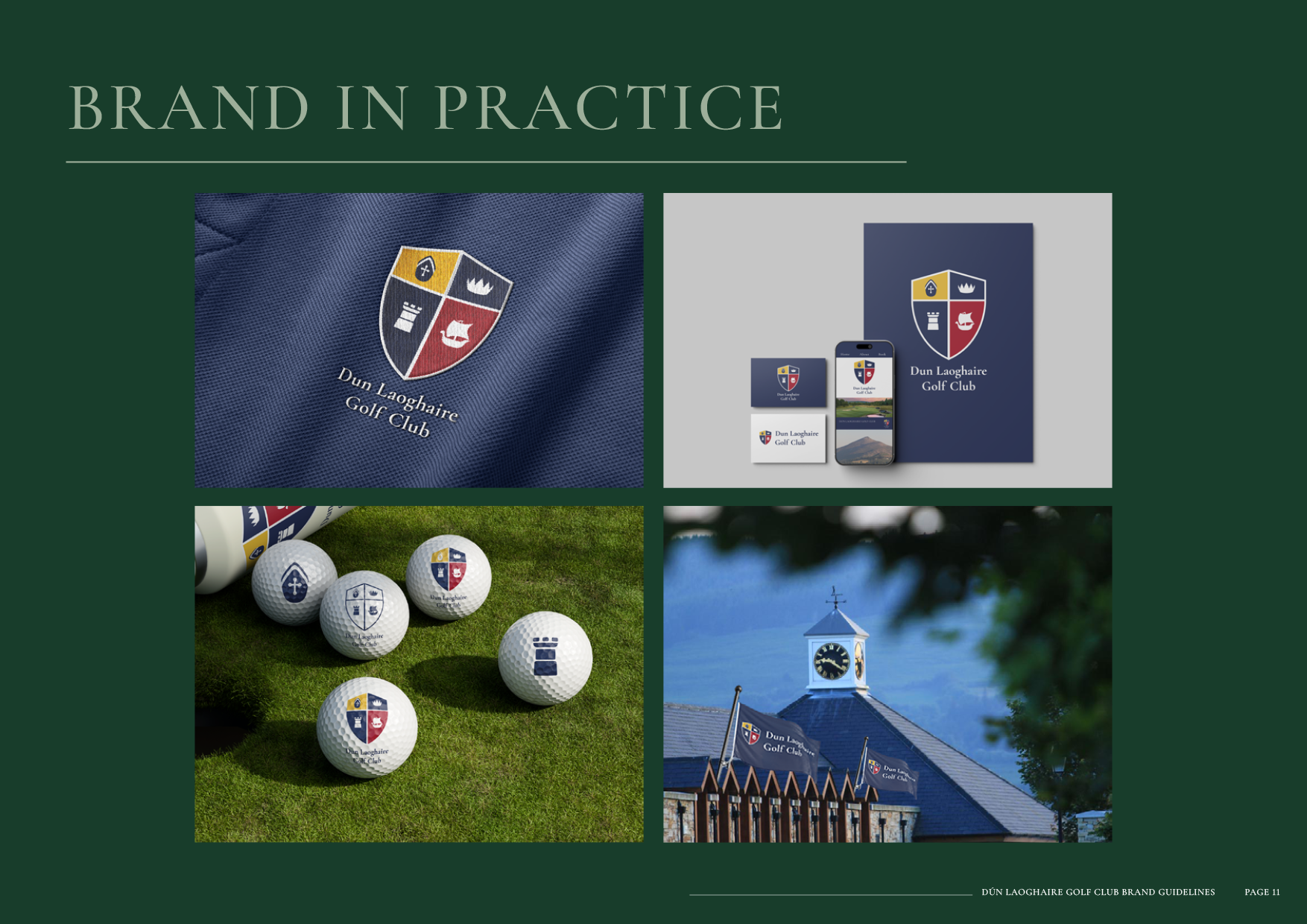
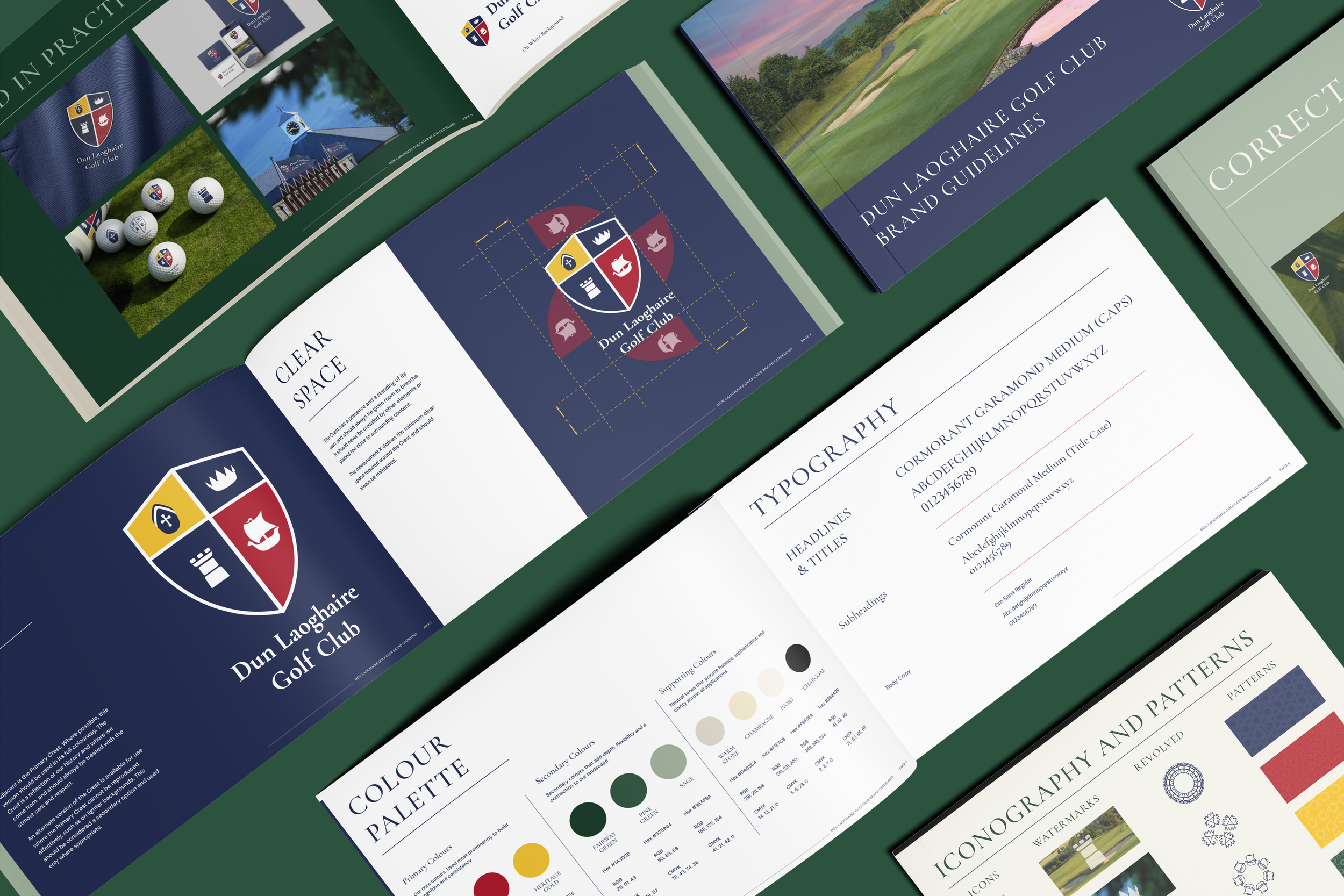
It was a real honor for dot Designs to be tasked and trusted with this job . We preserved and refined the details members recognise and developed a comprehensive set of brand guidelines around it. The guide explains which crest to use in different settings, how much space to give it, and how the club’s colours, typography, patterns and iconography work together. It gives the club and its design partners a practical reference for presenting the identity consistently in the exciting run-up to the Open and for years to come.
Primary crest and clear space
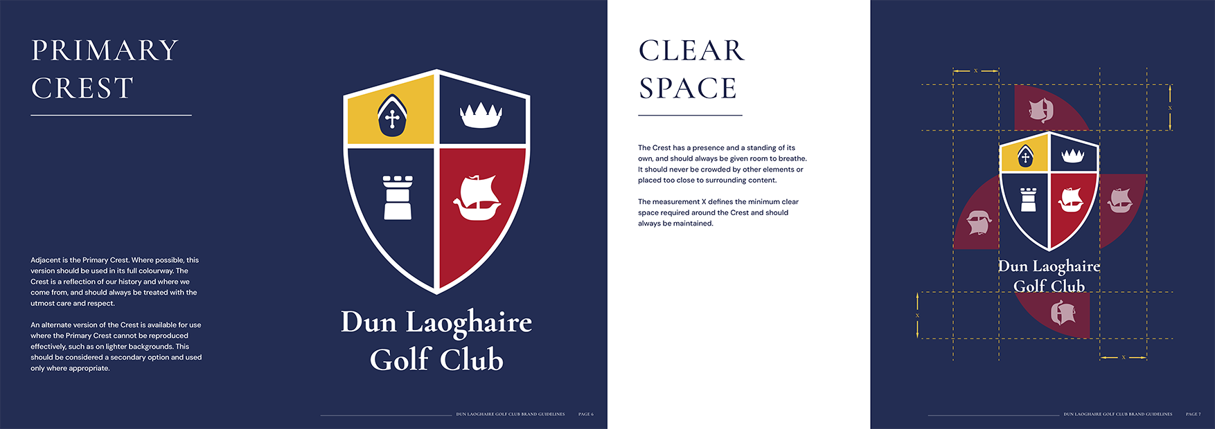
The refined crest preserves the details members recognise, from the crown and tower to the ship. A defined clear-space rule gives the crest and club name room to breathe alongside text and imagery.
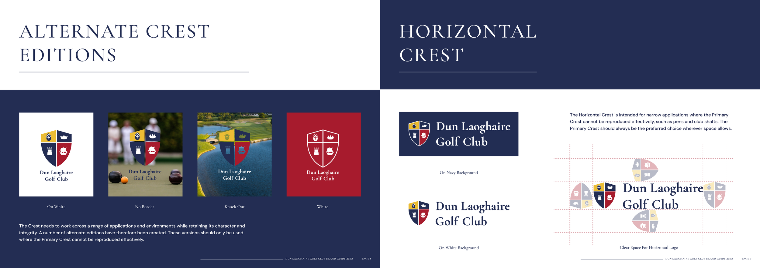
Alternate crest editions and horizontal crest
A family of crest variations gives the club a consistent identity across different backgrounds and formats.